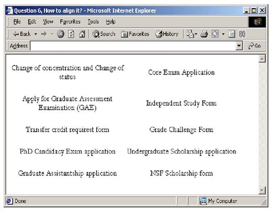
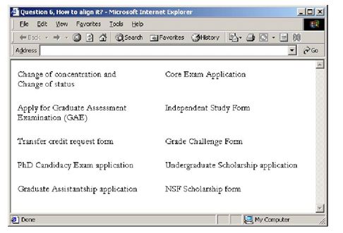
Figure 5-21 is an example that’s not well aligned. Explain what you would do to improve the alignment. It may be helpful to create a photocopy of the example and draw on it.

There are two columns of text, but the text in each column is left-right centered, which means there is no possibility of creating a virtual line that separates the background from the text. Further, the text is also centered vertically within its cell; in any case where there’s a two-line cell on the left and a one-line cell on the right (or vice versa), there will be a broken horizontal line.
The solution would be to left-justify and top-justify the text within each cell. The following show two possible ways of explaining what’s wrong with the example. The first shows how the text should be realigned horizontally to form a vertical line; the second shows how the horizontal lines are broken by vertically centered text. The last image is a solution for your reference.


You might also like to view...
Placeholders can be moved and resized
Indicate whether the statement is true or false
It is a good coding practice to zero-out any margins and padding using the ____ selector.
A. id B. universal C. class D. any of the above