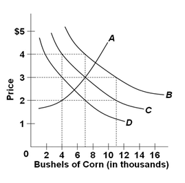
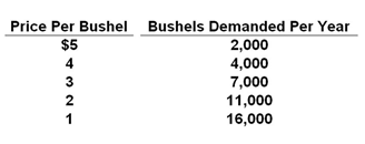
Which curve in the graph shown below best represents the data in the table?

Refer to the following table which shows the quantities of corn demanded at various levels of corn price (hypothetical data).

A. A
B. B
C. C
D. D
Answer: C
You might also like to view...
What is one result of the Medicare subsidy?
A) The health care industry is more efficient than it otherwise would be. B) Patients may elect to have some treatments that are of low value to them but that are costly to provide. C) The elderly population in the United States receives a lower quality of medical care than what is provided for the elderly population in other countries. D) The number of physicians in the United States has declined.
In the above figure, if the firm is producing Q1 units at a price P1, the firm should
A) increase output and decrease price. B) decrease output and increase price. C) not change output or price. D) shut down.