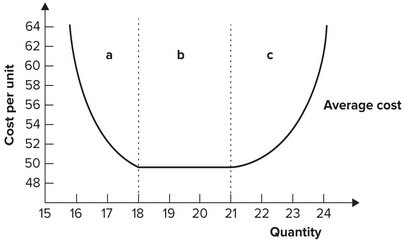
The above figure represents the average total cost curves of a wheat farmer
a. Which average total cost curve has the lowest average total cost of producing 30,000 bushels of wheat?
b. Over what range of output is the farmer experiencing economies of scale?
c. Over what range of output is the farmer experiencing diseconomies of scale?
d. Which average total cost curve has the lowest possible average cost of production?
e. Which average total cost curve represents the largest plant?
a. ATC3 has the lowest average total cost to produce 30,000 bushels of wheat.
b. The farmer is experiencing economies of scale between 0 to 30,000 bushels of wheat.
c. The farmer is experiencing diseconomies of scale for more than 30,000 bushels of wheat.
d. ATC3 has the lowest possible average total cost, which occurs at 30,000 bushels of wheat.
e. ATC4 represents the largest plant.
You might also like to view...
Cost-push inflation is due to:
a. "too much money chasing too few goods". b. the economy operating at full employment. c. increases in production costs. d. all of these.
Refer to the graph shown. Given the long-run average cost curve, a seller must produce 18 units just to break even if the price the seller expects is roughly:
A. $52. B. $54. C. $50. D. $58.