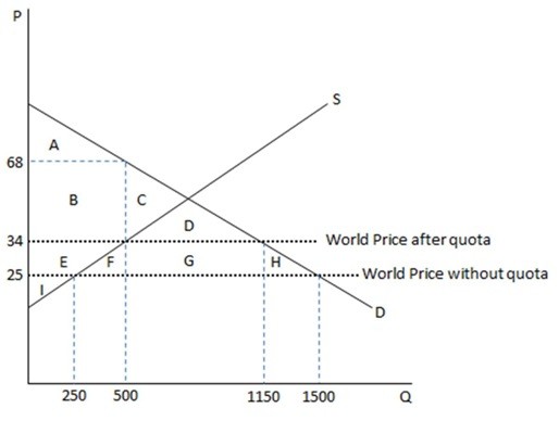
This graph demonstrates the domestic demand and supply for a good, as well as a quota and the world price for that good. As shown in the graph, when a government imposes a quota, the outcome differs from that of a tariff being imposed in that area:
A. G represents quota rents instead of tax revenues.
B. F and H are deadweight loss instead of transferred surplus.
C. FGH is deadweight loss instead of tax revenues.
D. E represents tax revenues instead of transferred surplus.
Answer: A
Economics
You might also like to view...
Recently, countries with higher per capita income have tended to have
A. higher GDP growth rates than poor countries B. lower GDP growth rates than poor countries C. negative GDP growth rates D. no tendency to grow faster or slower than poor countries
Economics
Refer to Figure 21.2. If area A = 2,000, area B = 400, and area C = 2,600, what is the Gini coefficient for Urbania (rounded to two decimal places)?
A) 0.40 B) 0.43 C) 0.67 D) 0.77
Economics